Finally redesign my WHOLE blog. It's quite a big project, I have twenty tabs on my Chrome and no less than five programs (for design purposes) running at once. Spent two weeks doing it...am very pleased with it now.
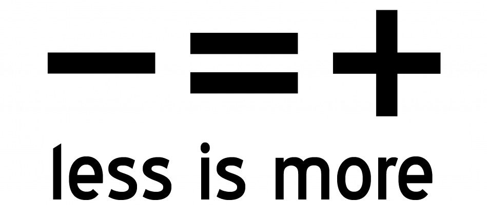
I'm starting to love minimalist designs. The colours I've chosen are white, grey and shades of pink. White space is extremely important, according to a lot of websites. It's elementary knowledge in the world of IT. So I have tried very hard not to crowd my blog and let my content actually show.
Less is more, in this case. And because of this, the hard part isn't about choosing stuff to brighten the blog, but rather about NOT choosing stuff. There are a lot of cute widgets I like, but I've successfully kept the mantra "less is more" in my head.

Butterflies is my main theme. So almost everything I've created for the blog has some butterflies. I love them; they just look so elegant and feminine, I use them a lot in many projects.
 |
| Isn't this pretty? |
And because I kept picking and picking, I ended up tweaking some html off codes done by others, and I've also designed almost ALL the images and every tiny little part of the blog, except for the post divider. Found the post divider somewhere online, it looks very vintage and I have no complaints about it.
It was fun designing the blog, it looks fresh now. I deleted the former ready-made template I downloaded off the web and installed a basic white template. Then started designing.
Felt very close to it because I know every detail about it. I learnt a lot more about html, it's really like magic wording, because it looks like a load of nonsense but turns into a lovely website if you know how to do it.
Used a lot of design/pic editing sites like picmonkey, splashup and EVEN Microsoft Paint (the old version, very horrible but workable thing) because my Photoshop CS5 wasn't working. Found many very helpful blog design tutorials online too, some of them are really good and specific. Got this grand idea of redesigning the whole thing after stumbling upon another blog, which really inspires me. Designed mine with my own creativity but somewhat based on that blog. Visit it HERE. Also got some good advice off HERE, and HERE. The rest are for little things, so I've sort of forgotten. The web is really a treasure trove if you know where to find the treasure.
(Update: The owner of the blog which inspired me, Jocelyn, also sent me an email explaining how she designed her blog after I asked about it. Thanks, it does help!)
| My "old" sidebar link |
 |
| My "OLD" button :) |
Hope you guys like my new design! Do tell me what you think of it :)


No comments:
Post a Comment
Do let me know what you think! :)